Selected work

Accomplishments

Increased adoption of Asana's out-of-office feature 3× through design and rollout improvements.

Shipped workflow modules from zero, dramatically speeding how solutions engineers build and maintain automated workflows.

Won 3rd place for designing a mobile app in 7 days that evaluates credibility, detects bias, and identifies false election content.

Placed 4th with UpBudget, a budgeting and automated micro-investments app designed in 24 hours.
Guided students through a self-created 16-week curriculum — from first UX portfolio to, for several, their first UX role.
About
Systems engineer by training, product designer by craft. I build tools that hold up under real work.
I studied Systems Design Engineering at Waterloo and trained across five internships — work management at Asana, workflow builders at Persona, security consoles at Splunk, and more. Along the way, I've mentored 20+ new designers through their first portfolios. These days I design full-time at Asana in New York.
{{ caseTitle }}
{{ caseDesc }}


Goals Strategy Map is a way to easily visualize relationships between an organization's goals and work. It enables executives and senior leaders to diagnose their execution and progress against their organizational strategy.
01 Define
Motivation
Increase adoption and retention for our Goals product
Less than 5% of enterprise customer domains have adopted our Goals product. Our hypothesis is that Goals Strategy Map will lead to more domain adoption of goals in the long term.
What problems exist with Goals today that inhibits adoption?
Customers struggle to see how adopting Goals impacts their organization's execution and strategy. Goal trees can have several layers of subgoals and related tasks, but the current setup only lets users move through each layer one at a time, without seeing the full picture (see below). This makes it difficult to pinpoint issues and identify what's blocking progress on a goal.
User pain points
Solution
To help solve these problems, we can help users visualize their goals through introducing a new way to view their goals and all their connections in context, a visualization tree!

Scope
We had a firm deadline to deliver an MVP by the end of 2024, so our design decisions were closely tied to what could be realistically implemented by the engineering team within that timeline. Because of this, Design and Engineering synced every week to ensure the designs met the engineering constraints.
02 Design
Card designs
One of my responsibilities on this project was to design the cards for all object types, including Goals and their connected work: Portfolios, Projects, and Tasks.
Designing these cards came with a few challenges. First, each object type had a lot of associated data, so we had to prioritize which information was most crucial for the diagnosis use case. We also had to carefully arrange this data within the limited card space, ensuring a clear hierarchy so that the most important details were seen first. Additionally, since each object type has different configurations and metadata, I had to maintain a level of consistency across different card types while clearly highlighting the most relevant metadata for each one.
As a result, I designed the cards based on two key principles:
What information belongs on a card?
To determine what information is most important to support diagnosis for each object type, we jammed with design and product leads of the Task, Project, and Portfolio teams.

After our brainstorming sessions, I synthesized the list of items to include on the cards and ranked them by importance. I then identified overarching themes across each object type to create a system of essential items to include on the cards.
Tasks: Completed, incomplete, approved, changes requested, rejected
Projects: Tasks/milestones completed
Portfolios: Status of contents inside
Tasks: Subtasks completed
Goals: Goal type, time period, team
Tasks: Number of blockers, number of comments
Card anatomy
Following the first principle of optimizing the order in which users receive information, I designed the card with a specific structure. Status and progress, being the most critical for diagnosis, are given the highest priority and stand out visually with the use of color. Additional metadata, such as the owner, is intentionally placed lower on the card and is more subdued to maintain focus on the most important details.

Final card designs
Applying the card anatomy to each card type resulted in the designs below. Following the second principle of striving for consistency while prioritizing utility, we kept the core structure consistent but made adjustments where utility took precedence. For instance, the progress display for Portfolios differs visually and functionally from other objects. This adjustment reflects the fact that measuring progress by task or project completion is less effective for Portfolios. Instead, progress is better measured by the statuses of the work contained within them.

Interaction design
Motion principles
Tability, our OKR competitor has an extremely jumpy and disorienting experience where it's frustratingly difficult to know what card you've just interacted or know where a goal you're interested in is on the canvas.
The issue is that the cards all shift positions after expanding or collapsing, with no motion between states to help users stay oriented.
Here are the key takeaways we can learn from Tability:
This results in the expand & collapse behavior below.
Expand expands one layer of children. Collapse collapses everything below. Furthermore, we use motion to display that the cards are fanning from or into the cards, to inform the user of the origin of the cards. This behavior also tested well in user testing with our prototype, with users quickly understanding what expanding and collapsing does.
What happens if a child has multiple parents?
When expanding a card that has multiple child elements, we re-orient these children beneath the most recently expanded card, treating it as the primary focus. This design allows users to keep the expanded card in view and easily access its child elements without needing to scroll (see below).
03 Review
Experience review
After designing the core experience, we presented our final work to the organization's leadership team, including the Head of Design, Head of Product Management, and Chief Product Officer at Asana, to secure the go-ahead for engineering to expedite their efforts.
Given the tight 1-hour window to cover the entire MVP experience, we also shared a pre-read video in advance. During the presentation, we walked through our key decisions, backing them up with UXR findings, data, and product intuition. Below are some of the core experiences we focused on and the rationale behind them.
Entry point
The Strategy Map tab is the new landing experience for Goals because it better showcases relationships and delivers more of a wow factor. On first view, users will see the top layer of goals with one child expanded.
Data science insights revealed that 97% of active goal domains have work within the first two levels. By defaulting to this view, we ensure that most customers will see work on the screen at initial load, clearly demonstrating how this view connects work to goals.

Right pane
Clicking on a card opens a right pane where users can view additional details about an object that aren't visible on the card, as well as make changes or add comments. From this pane, users can also open the full detail page of the object in a new tab.
We designed a new right pane for Goals, maintaining consistency with existing patterns for right panes used in Portfolios, Projects, and Tasks. This right pane is essential, allowing users to dive deeper into an object without navigating away from the current page.

Filters & highlights
In this experience, we use two types of filters: traditional filters that remove objects from the canvas, and highlight filters that keep all objects visible but emphasize the relevant ones while de-emphasizing the rest. The purpose of these filters is to provide flexibility depending on the context. For example, with Team filters, you typically want to remove non-matching objects from view. However, with filters like Status, you might still want to see objects with different statuses to understand their relationships.
The highlight filter, a new pattern at Asana, performed well in UXR testing, with a senior program manager at Amazon saying: "It would be really useful for me to intuitively see what's relating to what, because I would just know how everything's laid out [already]. So I'm not changing the format and I'm not changing how I'm perceiving the goals… So, yeah, I think that having the highlights works really well." Both filter types are therefore essential for this experience.

HIGHLIGHTING "AT RISK" AND "OFF TRACK" STATUSES
Feedback
The presentation was very well received by the org leads. Their main feedback centered on how we could better drive adoption for users who start with zero or very few goals. The majority of our customers don't currently have goals, meaning many users would initially encounter an empty canvas when landing on the goals page.
In addition to addressing this zero-state, we also recognized that many customers have sparsely populated states, with only a few goals on the canvas, which doesn't fully showcase the potential of the Goals feature. Only our large enterprise customers have complex, intricate goal trees, but in an ideal Asana world, every piece of work is connected to a Goal.
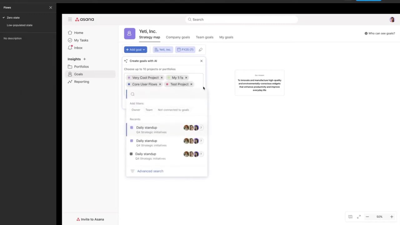
Therefore, we aimed to find a way to excite users during their first experience with Goals and make it effortless to build a goal tree, whether starting from scratch or from a low-populated state. One exploration, beyond the MVP scope, involved incorporating AI into onboarding and creation.
04 Future
AI explorations
Creating goals with AI
Implementing an AI-driven onboarding experience for users with few or no goals achieves multiple benefits:
Shipped
Goals Strategy Map shipped to all customers in February 2025 — headlining our Winter 2025 release announcement.